Wednesday, December 24, 2008
Buzz and Baby
Monday, December 22, 2008
Painting Different Folks
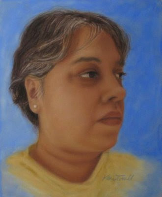
I had just finished rereading “Harley Brown’s eternal truths for every artist” when I received my photo reference, so I grabbed a piece of suede matboard and smeared pastel over it to “show it who’s boss,” as Harley advised. I was really impressed with myself for a couple of seconds, but I had no idea what to do next (I thought I had learned something reading that book, but it’s so easy to get distracted by the pictures). So I decided to block in the shapes as usual, but do it colorfully with blues, greens, yellows and oranges. Am I wild and crazy or what? It didn’t last long, though.
Here’s what I learned about myself: I have to get a good likeness. I can’t not do it. It makes me crazy. I started layering on normal colors and turned it upside down to check my proportions. Pretty soon my portrait was looking like the original photo. Just to compensate for my boringness, I put some wild color into the background. Plus, I’m slightly off and I’m not even going to correct it. Yep, that’s me, living on the edge.
.jpg)
Soft Pastel on Suede Matboard
Thursday, December 11, 2008
Boots
.jpg)
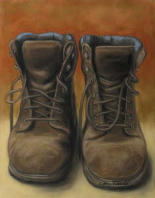
Soft Pastel on Suede Matboard
Monday, December 1, 2008
Buddha & Hydrangeas
.jpg)
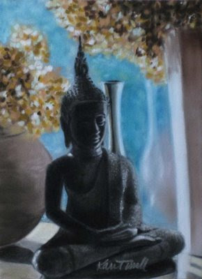
I used mostly Sennelier soft pastels on this painting because I wanted to see how they work on suede matboard. I’m impressed! There was very little dust, and the color stays put. After using them on velour paper, I was ready to give up the Senneliers, so I’m thrilled they work so well on the suede matboard. They are so nice and soft and creamy, and I love them.
Saturday, November 22, 2008
Portrait of Frankie
.jpg)
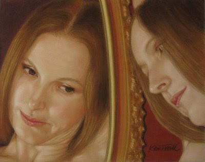
8”x10”
Soft Pastels on Suede Matboard
Friday, November 21, 2008
I'm IT!
Apparently, you’re never too old to play tag. I just got tagged by Vern Schwarz. Here are the rules:
1. Place a link to the person that tagged you
2. List seven unusual things about yourself
3. Tag (and link to) seven other artists at the end of your post, and post on their blogs to let them know they’ve been tagged.
It took me a long time to think up seven things about myself. I don’t know why they feel like confessions, but given the subtitle of my blog I suppose it’s appropriate:
1. I used to draw incessantly when I was a kid (pre-teen/teenager) and then went cold turkey with my art until a couple of years ago. Now I’m even more obsessed than I was back then.
2. I sometimes have a major “ugly stage” where I hate whatever I’m working on, and I seriously consider trashing it. Once in a while I actually do give up and start over, but usually I keep working and it ends up okay. After realizing that this is just part of my process, I have made peace with the ugly stage. I don’t look forward to it, but I don’t have to talk myself off a ledge either.
3. (Okay, here’s a gross one which shows my desperation in thinking up interesting things.) In high school, my best friend and I shared a locker. Just to amuse ourselves, when we were finished with our chewing gum we would stick it inside the door of the locker, especially in the ventilation slots (it stuck better there). People would walk by and comment on how disgusting it was, then ask if they could add their gum to it. It was really a work of art, a sort of community project. Until someone ratted us out, or else one of the teachers noticed gum poking out the slots, and we had to take it all down.
4. I never took art classes because I didn’t think it was possible to have a career in art (the whole “starving artist” thing seemed unappealing). In fact, I wanted to be an architect until I took my first (and last!) architecture class in college. Some of the things they made us do were mind-numbingly tedious.
5. My husband and I both grew up in southern California. It took me a few years, but I finally persuaded him to move to Washington, even though I had never been here before and we didn’t know anyone who lived here. I know it’s strange, but I just knew this was where I was supposed to be. We’ve been here 16 years now and are very happy.
6. I used to go on autopilot whenever I would drive. I’d miss my offramp, or go the wrong way and not know it, until I would all of a sudden become aware that I was completely lost. When I got pregnant with my first child and had gotten lost on the way to my OB/GYN appointment for the third time, I decided I had to change. It’s extremely rare that it happens these days, but my kids think it’s hilarious when it does. I’m just grateful my car has a navigation system.
7. I purposely chose April 15 for my wedding day because I knew it would be impossible for me to forget our anniversary. It worked. And as a bonus, we’re always motivated to get our taxes done early so we don’t ruin our anniversary with tax stress.
Now that you know more about me than you ever wanted to know, here are the artists I’m tagging: Pat Burns, Tracey Allyn Greene, Tif Matthews, Kim Niles, Frankie Paquin, Heather Simms, and Torrie Smiley. It may take them a while, or they may not want to play, and that's okay, too. :)
Sunday, November 16, 2008
Upside Down Walker
He did have a point. Painting it upside down would take my brain out of the process, and maybe I could paint it loose. I decided I would draw it out first. This seems counter-intuitive, but I think when I don’t draw it first I’m so obsessed with getting everything correct that I can’t concentrate on how I’m painting. So I drew out my composition (upside down, of course!) and went to work. I didn’t like how the reference photo made the woman look like she had laser vision or something, so I changed the background a bit, and flipped and cropped the original.
We’re allowed to spruce it up a bit after we turn it right side up, but I decided not to. I didn't want to re-work anything and take away the point of the challenge. It was a good learning experience (even though it would have looked better in pastel!).
Here it is, painted entirely upside down except for my signature.
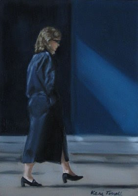.jpg)
Friday, November 14, 2008
Another Portrait on Velour Paper
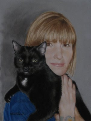.jpg)
12” x 9”
Soft Pastels on Velour Paper
Friday, November 7, 2008
Shadows
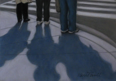.jpg)
I decided to do this week’s challenge for the Different Strokes From Different Folks blog in pastel, simply as a time saver. My projects are piling up, and I needed to do something quick.
I cropped the original photo to focus mainly on the shadows, used a pastel pencil to sketch out my composition, then layered on the pastel. Simple, quick, and easy! I love it when that happens. Sometimes the struggle is fun, or at least rewarding in some way, but the lack of struggle is always refreshing.
Wednesday, November 5, 2008
U.S. Capitol
When I saw the reference photo, I was determined to paint it loose and expressive. (That actually happens every time, but this time I knew I would do it!) I chose a small board and didn’t sketch it out first, didn’t even allow myself a paint sketch. I just picked up a brush and started blocking it in. A perfect recipe for loose, right? An hour later I had to laugh at myself. Loose and expressive clearly isn’t my thing. And I’m not going to get frustrated anymore because it isn’t. It is what it is.
What I did find, though, is that giving up my expectation of painting it loose and expressive did free me up a bit, so that’s worth something! I didn’t worry so much about it being perfect. If it wasn't smooth enough, too bad. If I accidentally put things in the wrong place (and I did!), I just let it be. And it did turn out pretty loose, for me. Painting it was a liberating experience, even if it wasn’t as loose as I wanted it to be.
Maybe I’ll surprise myself with this week’s challenge and truly paint it loose, and maybe I won’t. Either way, I’m okay with that.
Tuesday, October 28, 2008
An Alabama Cow
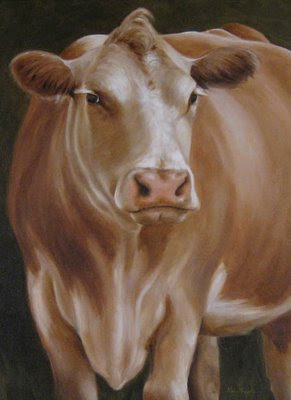
This is my submission for this week’s challenge on Karin Jurick’s “Different Strokes From Different Folks” blog. Once again, my goal was to do something quick and loose. I failed on both counts. It’s somewhat loose, but not quite my goal, and I messed with it way too long. I thought you might like to see a couple of WIP pics of my process.
I started out fine. I did a loose and sloppy sketch with thinned out paint on a toned canvas:
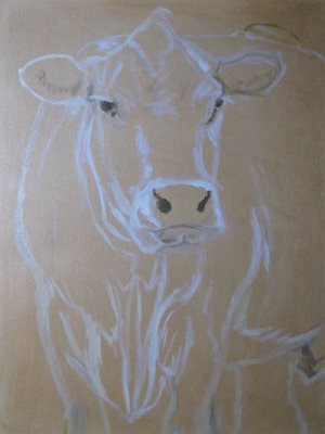
Then I slopped some paint around:
Saturday, October 18, 2008
New York Stock Exchange
Monday, October 13, 2008
Another Portrait
Saturday, October 11, 2008
The Bean
This has to be the strangest thing I’ve ever painted. It messed with my mind. I thought I had shapes painted correctly, but when I’d walk away and come back to it, I would realize I didn’t. After repainting the buildings a couple of times, I had to resort to painting it upside down or sideways, just to get my brain to let go of what it thought was correct. It was a fun challenge, though!
Tuesday, September 30, 2008
Equality in Art
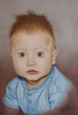
This one is on La Carte paper, which is textured similar to sandpaper. It was really hard to get used to, and I made plenty of errors. Fortunately, this paper holds a lot of pastel. Once I figured out where I was off, it was easy enough to correct. One thing I really like about this paper is that it sharpens the pastel as you use it. Nice for details.
Friday, September 26, 2008
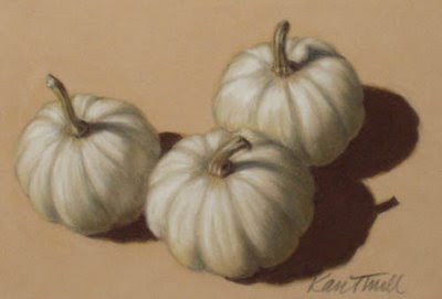
Pumpkins!
.jpg)
5”x7”
Soft Pastel on Suede Matboard
Fall is my favorite season. I love the crisp air and changing leaves, the smell of wet leaves and pine trees, and, of course, pumpkins! I’ve had pumpkins in mind for a painting, so when I saw Karin Jurick’s “Different Strokes from Different Folks” blog, I quickly decided to participate. What a fun idea! Each artist creates a piece based on the same photograph.
Tuesday, September 23, 2008
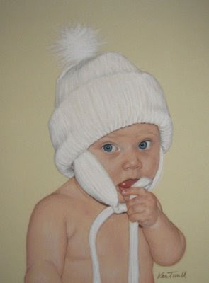
Pastel Portrait on Velour Paper
.jpg)
Wednesday, September 10, 2008
Finished Oil Paintings
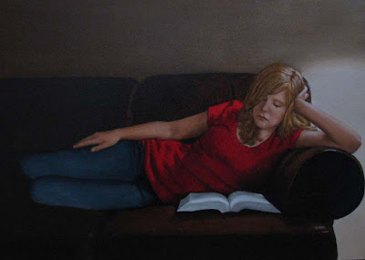
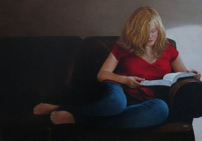
On a fun note, my pastel paintings “Annie” and “In Memory of Kacie” just won Member’s Choice and Patron’s Choice, respectively, in EBSQ’s Pet Portrait Swap show!
Saturday, August 23, 2008
Annie: A Portrait
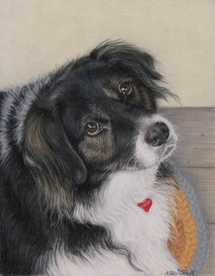 "Annie"
 .jpg)


.jpg)
.jpg)